Kelsie Grazier BRANDING
Branding/ logo & print design
Key branding words/ calm, minimal, soft


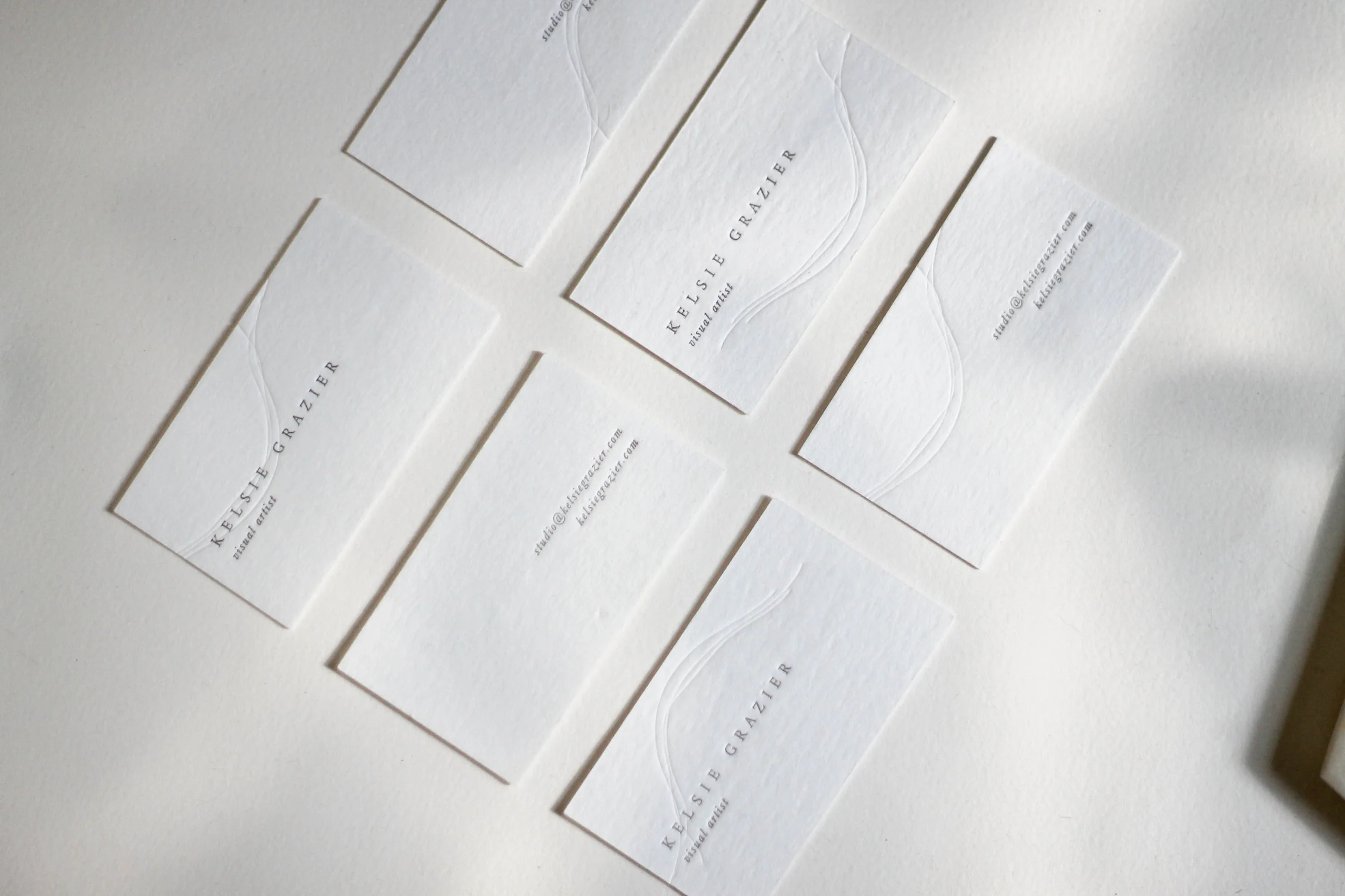
Kelsie Grazier is a contemporary visual artist based in British Columbia. What inspired her to create was her sudden deafness and tinnitus. The fine white lines as seen in her work, and across the business cards represent sound waves, or lack thereof in her life. When working with Kelsie, I wanted the branding design to compliment her subtle work, blending seamlessly into one cohesive look. Thus, the beautiful fine lines became a staple in the branding design. It dances gracefully across the letterpress business card printed in house, by hand, personally on our antique letterpress!